GET READY FOR Packaging Trends

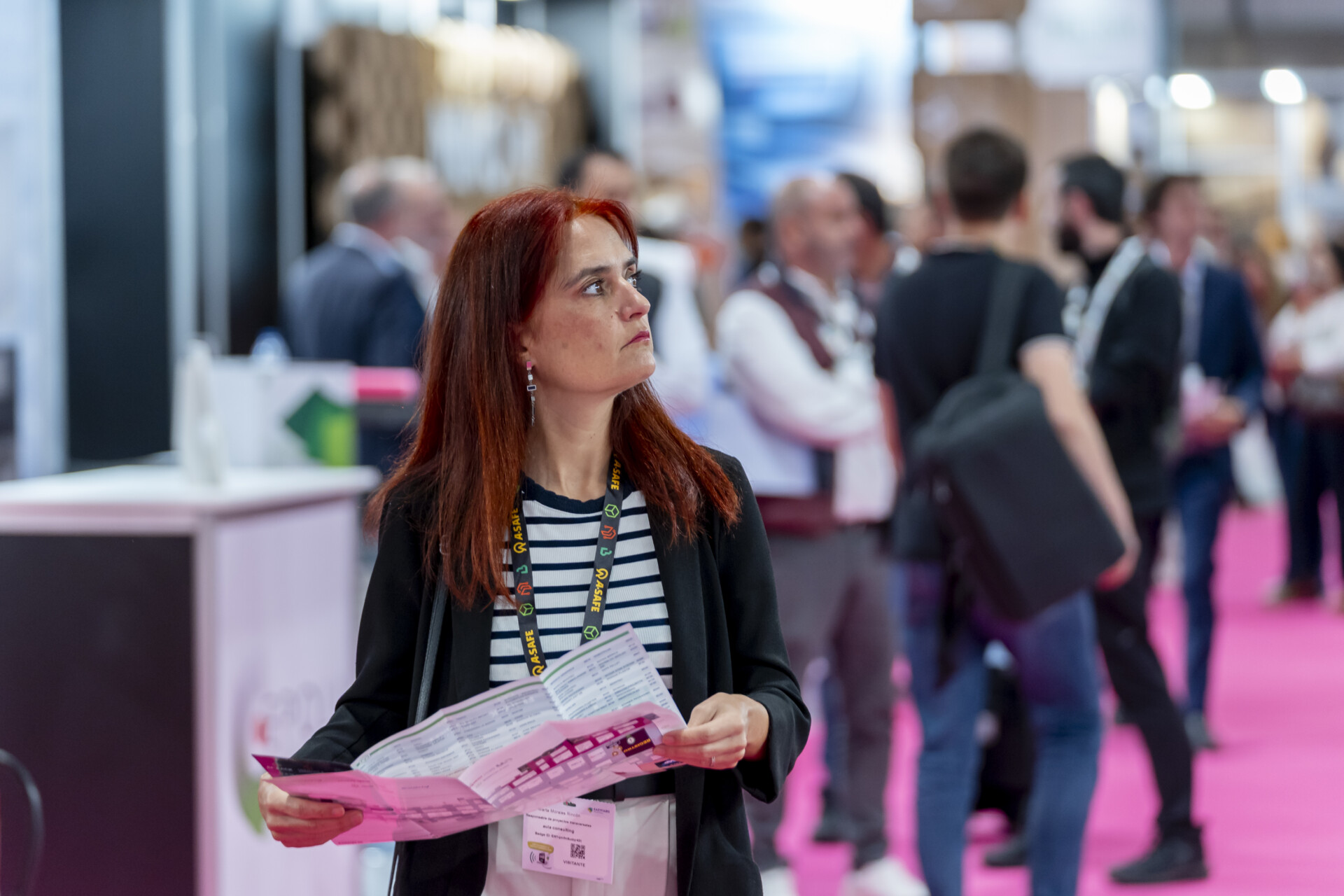
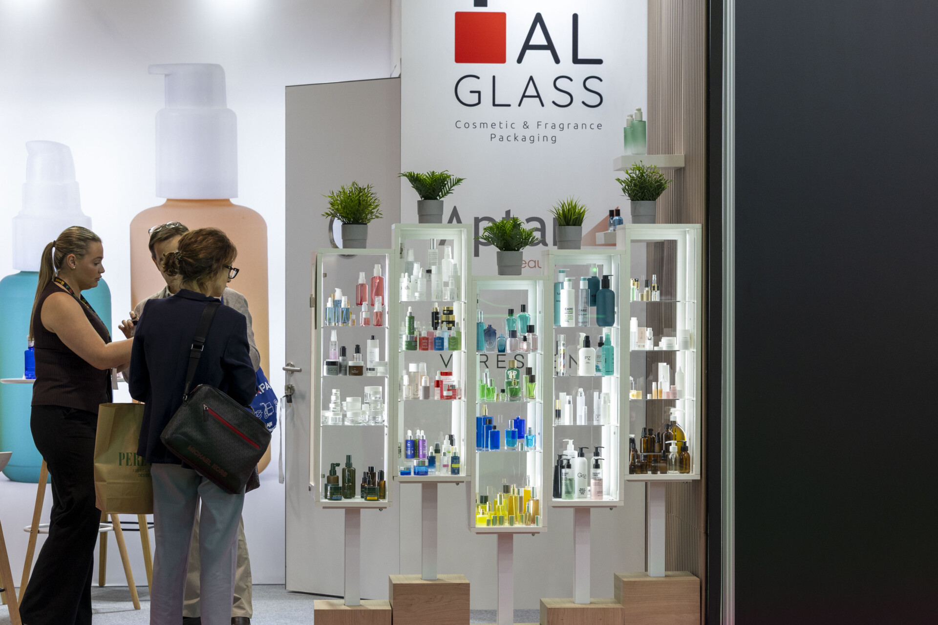
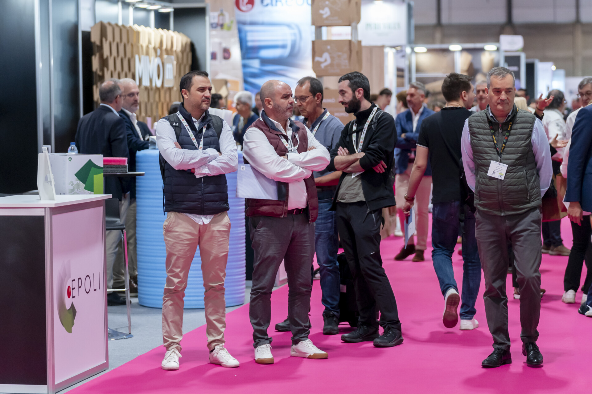
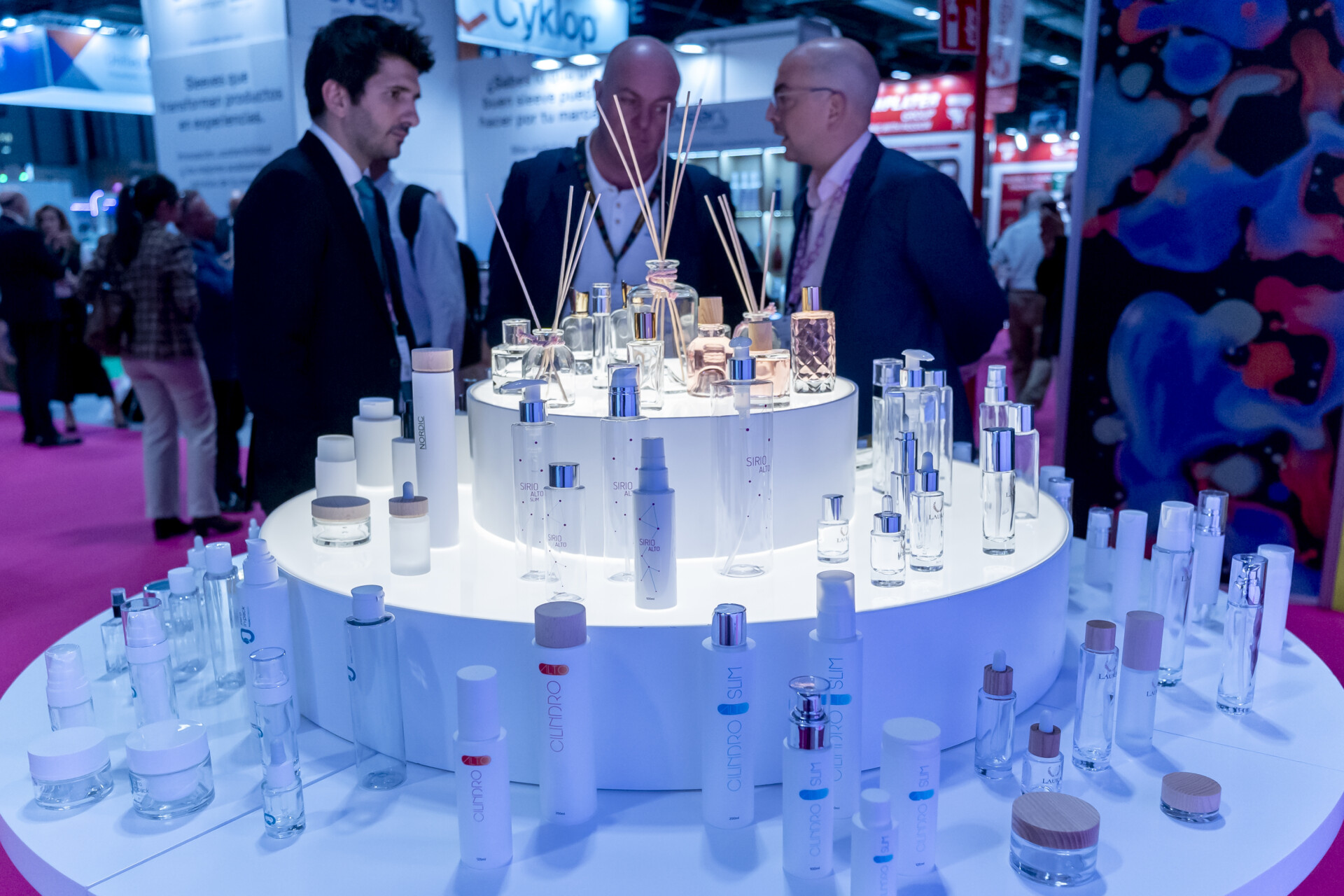
Every year, the Packaging area welcomes companies with new ideas and solutions for end-of-line packaging, packaging design and value-added labelling. Because Empack Madrid is more than just packaging, it is also a space for design and innovation for your primary packaging, a distinct and exclusive area within the event that invites you to dress your products in the latest seasonal trends.

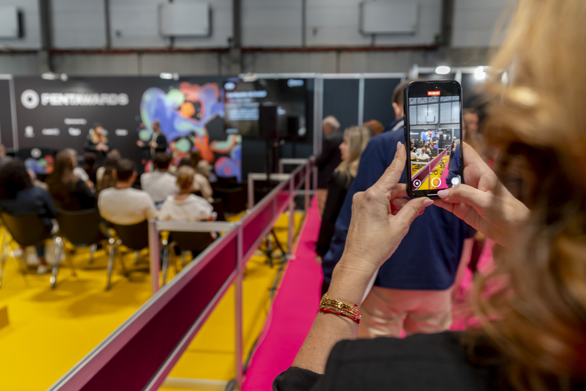
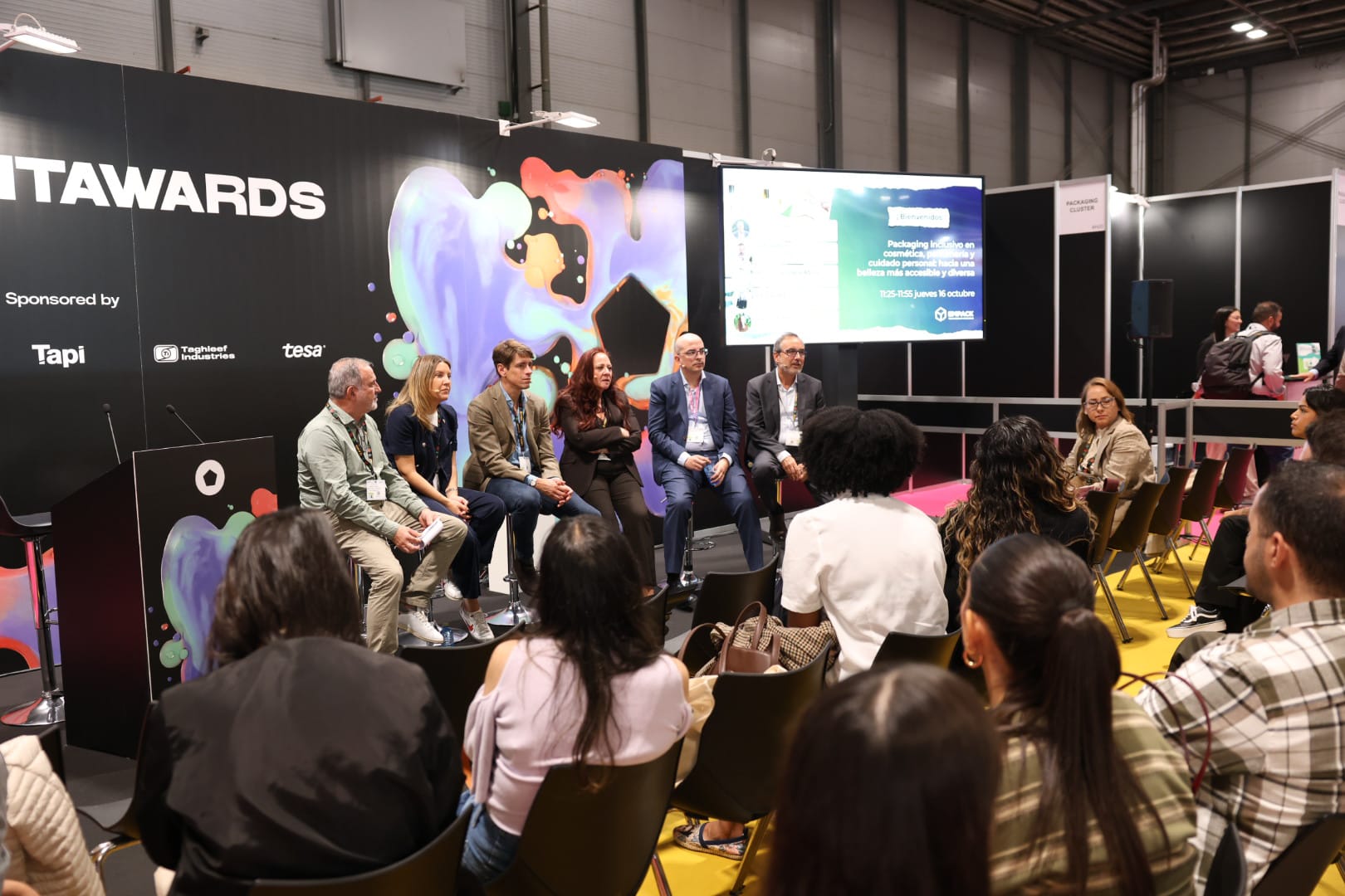
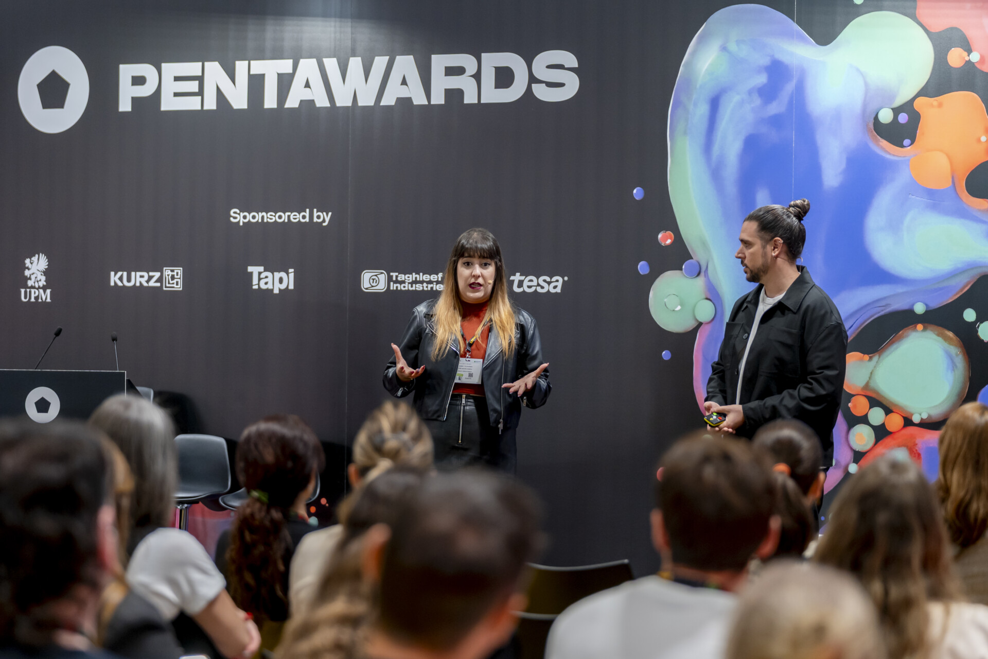
In addition, this space brings together, exclusively for Empack Madrid, the Pentawards Designers Day and the exhibition of the finalists of the acclaimed awards.

And after the ISLAND that was born in 2024, we have revamped the corner dedicated to DESIGN AGENCIES with more urban tones. Discover the DESIGN DISTRICT, exclusively dedicated to the solutions that different studios and designers have to offer to refresh your image and put your packaging at the forefront. Rebranding, trends, future materials, innovation…😊

Would you like to enjoy the latest solutions for final packaging next autumn?

DISCOVER MORE...

DISTRICT OF OF DESIGN

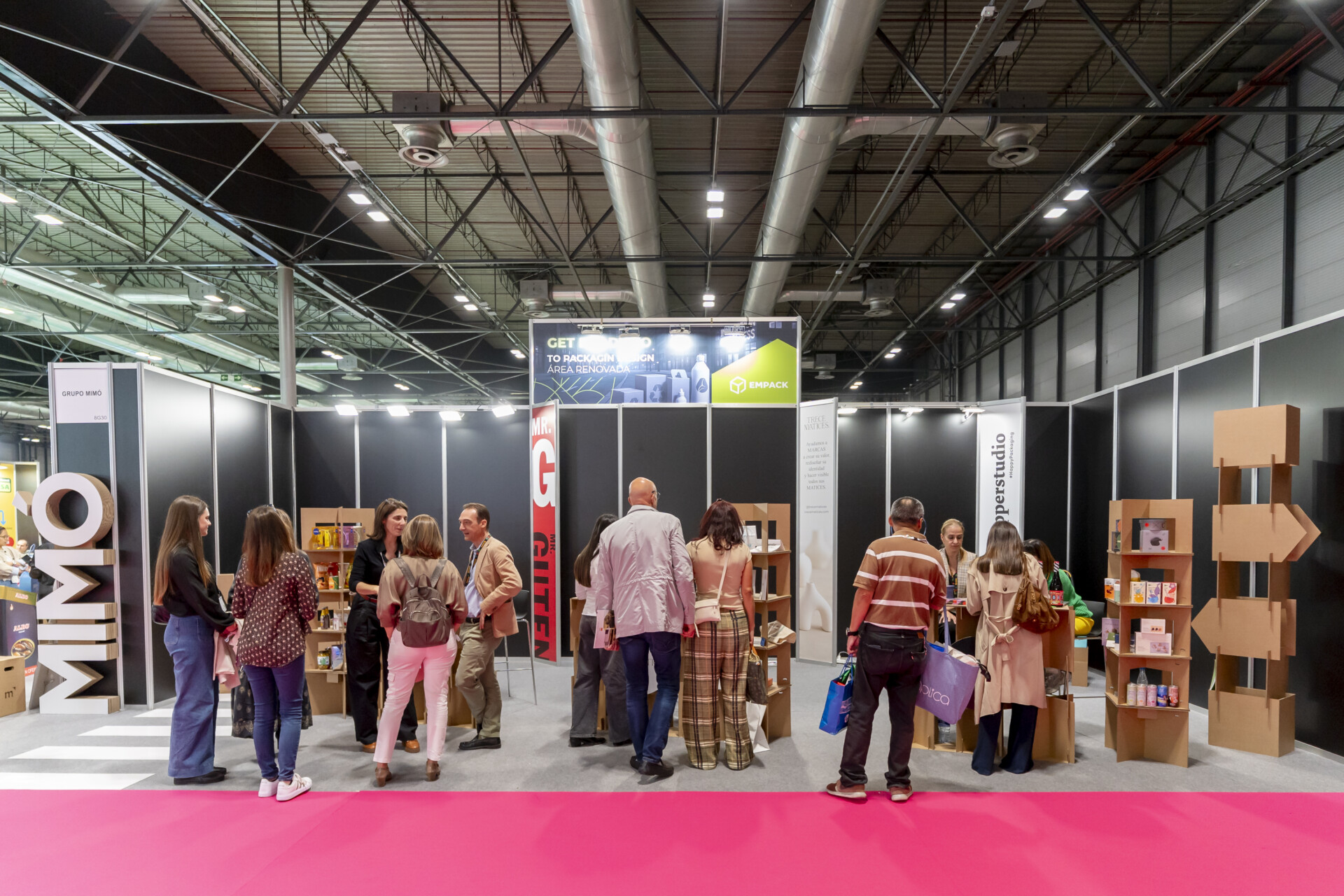
If you are interested in packaging design or need to explore solutions in this field, you are in luck… DESIGN DISTRICT awaits at Empack Madrid: an area exclusively dedicated to the solutions offered by different studios, agencies and designers.

This space was born as “Island of Solutions” and has been renovated and renamed: ‘The Design District’ and aims to promote creativity in packaging design, where a handful of design experts present their work, present their success stories and connect with other companies looking for answers to their challenges.

The initiative seeks to highlight packaging design as a crucial element in brand differentiation and consumer experience, contributing their knowledge of the world of branding and its vital role in any packaging development. From now on, this space will allow designers to showcase their creativity and explore new opportunities for collaboration with companies from all over the world.

Design studios that will be present in 2025

thumbnail_MR_GUTENBERG_BNHD
logo-Trece-matices

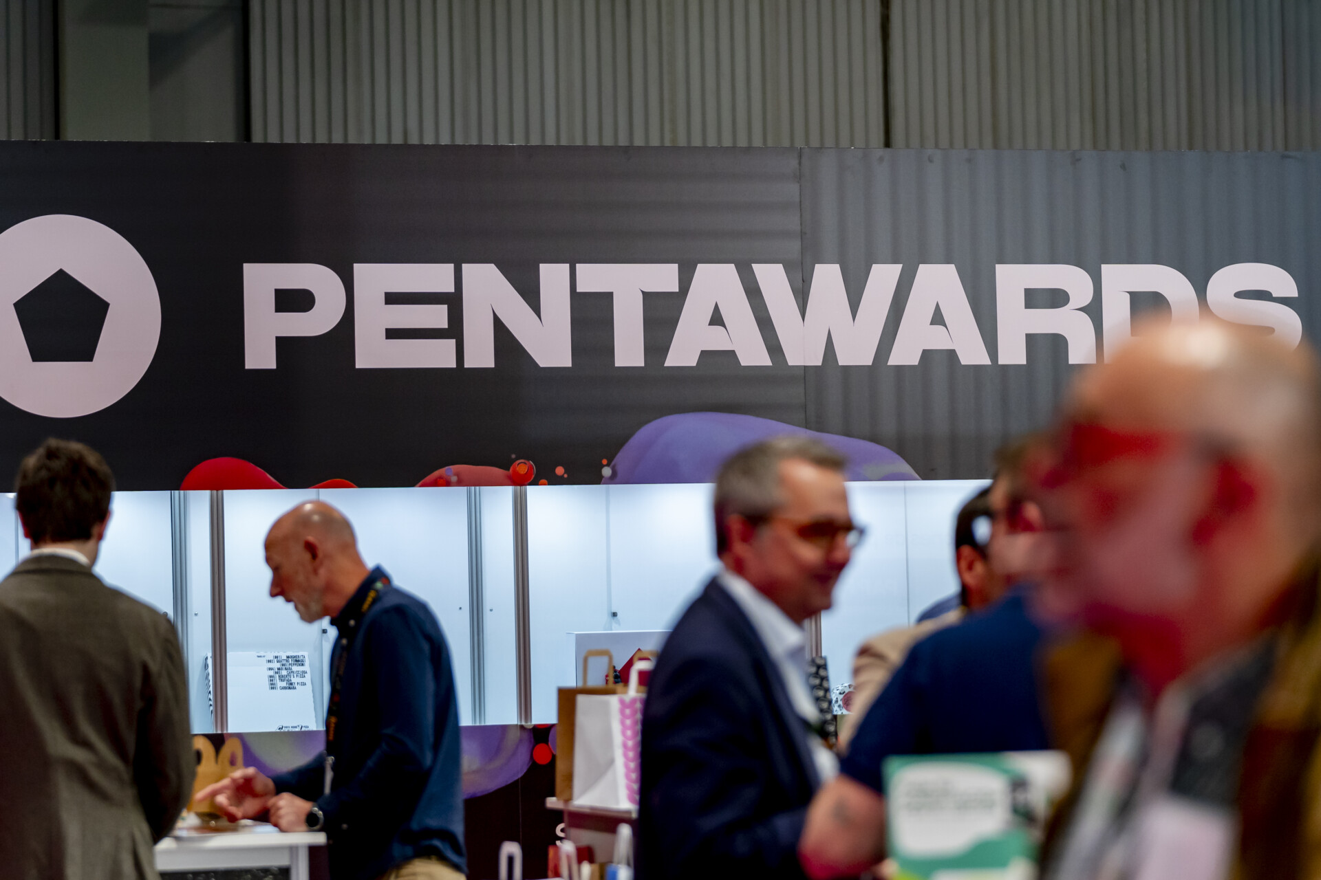
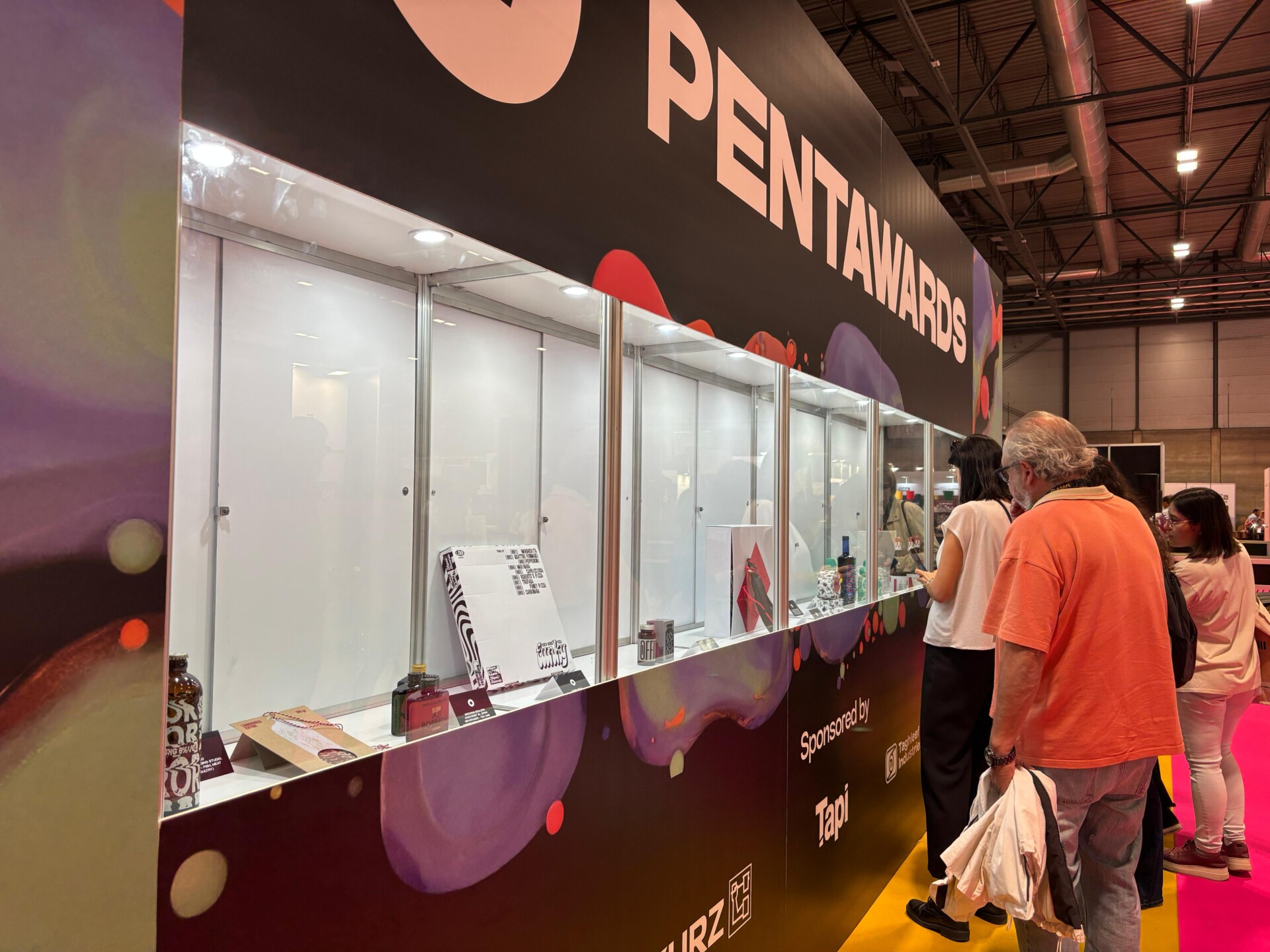
Pentawards winners Expo 2024

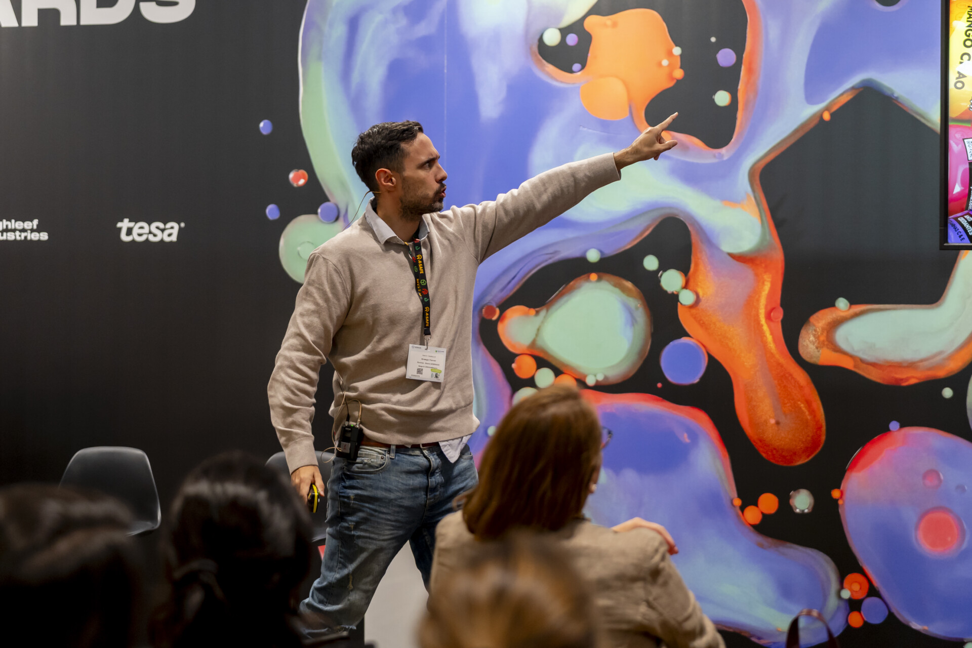
Every year, we get to see the winning packaging designs from the Pentawards, the world’s most prestigious packaging awards, which, accompanied by a conference room, offer a glimpse into the trends and innovations that lie ahead for the sector.

While we wait for the next winners… Take a look at this year’s designs!

And more and better to come soon 🤗

ASPRONAUTA

Aspronautas is an inclusive wine created by four people with intellectual disabilities, who led the process from vineyard to bottle. The name fuses ASPRONA with astronautas, presenting them as “explorers of the wine universe.” Bottles are imagined as rockets, with labels depicting the four aspronauts alongside their own hand-drawn illustrations. The result is a vibrant, collaborative design that celebrates creativity, empowerment, and the journey of reaching beyond limits.

BOTA DE VINO WINESKIN

Bota de Vino reinterprets the traditional wineskin with a matte black finish, red accents, and a minimalist, sophisticated aesthetic. A silver bag-in-box ensures the wineskin can be refilled while preserving quality, and the set is housed in a rigid box with die-cut foam. Both the boot and lid identity are placed at a tilt—an intentional symbol of complicity, spontaneity, and looking at tradition from a new angle. The result is a tribute that blends heritage with contemporary character.

CONNECT 4

This wine packaging reimagines the classic Connect 4 game, turning the bottle into an interactive experience. Removable sticker tokens invite consumers to play, while a flag-shaped collar and round back label echo game elements. The name, highlighted with gold stamping, reinforces a premium feel, creating a design that is playful, original, and a true conversation starter.

ERROR

ERROR is a NEIPA that proudly embraces distortion — hazy, handcrafted, and deliberately offbeat. Unfiltered, hazy, and proudly imperfect.
ERROR challenges the conventions of traditional beer packaging. It’s raw, contemporary, and intentionally flawed, inviting consumers to rethink the meaning of craft, beauty, and environmental responsibility.

FUNKY PIZZA

This project beautifully exemplifies how funky music and Italian food can come together in perfect harmony, creating an experience that is truly music to your senses…

GOCCO

For Gocco’s first children’s fragrances, the design breaks from conventional perfumery codes with playful, tactile bottles whose rounded forms invite imagination—whether seen as a spinning top, submarine, or flying saucer. Bold colours, vibrant orange and deep green, heighten expressiveness, while reusable cylindrical boxes extend the sense of play and function. A strong typographic identity completes a contemporary design that balances fun, creativity, and brand essence.

Los Quesitos de Anabel

Los Quesitos de Anabel are born in a small educational farm in Gran Canaria, where Anabel, a young farmer, welcomes families and children to spend the day, meet her goats, and enjoy hands-on workshops. Her project blends tradition, learning, and tenderness. The packaging turns that experience into a memory to take home.

LYV coffee

Inspired by the brand's connection to mixology and specialty coffee, LYV coffee's packaging adopts the form of an iconic bottle that evokes the exclusivity of fine spirits. This design choice celebrates sophistication and reinforces the brand narrative, positioning coffee as a premium product that transcends traditional industry conventions.

ISLE OF WIGHT TOMATOES

B&B STUDIO, UNITED KINGDOM

FOOD – FRUIT AND VEGETABLES

OFFICE SUPPLIES

Office Supplies positions CBD as a professional aid rather than a domestic product, reframing it as part of everyday workplace tools. The identity uses a bold, monochrome design with industrial elements, while references to paper clips, erasers, and rulers reinforce the concept of utility and effectiveness. Minimalist packaging communicates clarity and functionality, creating a distinctive, memorable brand that normalizes CBD within a professional context.

PUEBLO

Pueblo is a tribute to Spain’s villages—the source of enduring traditions, flavours, and craft. The design captures this spirit through bold typography that places the name at the center, paired with earthy colours inspired by adobe bricks and sun-dried straw. A minimalist presentation is elevated by the inclusion of the iconic curing rope, a subtle detail that grounds the identity in authenticity and heritage while conveying strength, simplicity, and pride.

POLA COSMOLOGY

POLA INC., JAPAN

BODY, HEALTH & BEAUTY - SKINCARE

More than 15 years of providing solutions to leading brands

Exhibiting companies
+ 50
Visitors
+ 300
Expert speakers
+ 1

Relive the best moments

PENTAWARDS HALL

PENTAWARDS HALL

Specific top-level speakers in the room co-organised by the brand organiser of the industry's most important design packaging awards.

EMPACK HALL

EMPACK HALL

Sectoral trends in packaging.
A meeting point to present the changes and trends affecting the packaging value chain.

Specific conferences by leading experts