Skincare reinvented: Binomial, Morillas’ fresh, inclusive and transparent proposal.
Binomial is a new skincare brand created to meet the needs of a generation seeking simplicity, effectiveness and authenticity. In a cosmetics market saturated with unrealistic promises, it emerges as a proposal designed for young skin, with easy-to-follow routines, high-quality ingredients and visible results. Its purpose is to bring effective skincare closer to Gen Z without complications, embracing transparency, innovation and a visual aesthetic that conveys freshness.
From the very beginning, Binomial defines itself as a brand designed for Gen Z — a generation characterised by critical thinking and hyper-digital connectivity. These consumers know how to read labels, research ingredients and look for brands that communicate in a direct and honest way. That is why Binomial does not aim to be just another brand, but rather a new paradigm that breaks down myths around skincare and focuses on what truly matters: simple routines and innovative formulations.
The approach is clear: to offer effective cosmetics that simplify young people’s lives and support them as they begin a healthy relationship with self-care. Today’s market is filled with generic proposals promising miraculous results in just a few days. This narrative is increasingly questioned by younger consumers, who demand real efficacy and distrust unfounded claims. For them, skincare should be an ally, not a burden. This is where Binomial finds its space to stand out, with advanced formulas that combine science and innovation in an accessible language.
At the heart of the proposal are its simple and effective routines. The brand understands that skincare does not need to be complicated, but should instead adapt to everyday life. That is why it focuses on easy-to-use products designed to integrate effortlessly into any routine. Beyond simplicity, the formulas are developed with an innovative mindset. Surprising galenic forms are introduced, transforming the experience from the very first application, offering changing textures and measurable effectiveness. The result is healthy, radiant skin in balance with its natural biome.
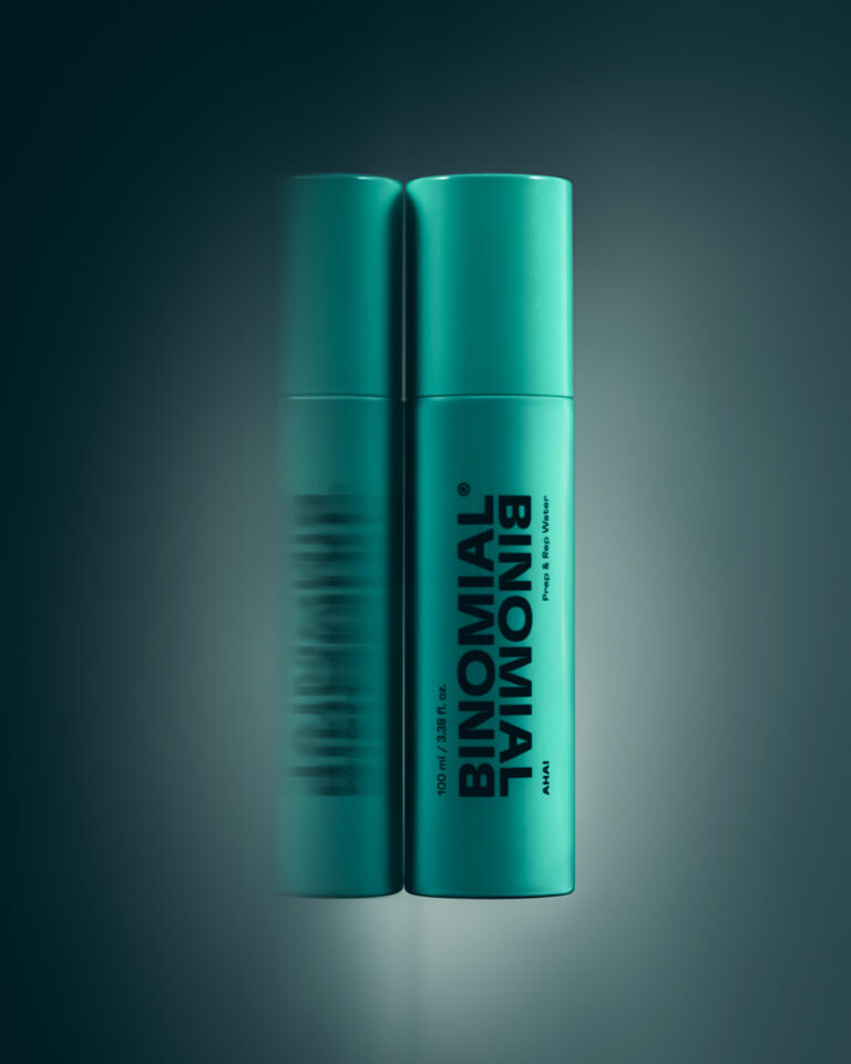
The name “Binomial” is a statement of intent. Inspired by the mathematical concept of the binomial, it symbolises the union of two elements that, when combined, enhance each other: powerful active ingredients and probiotics that regenerate the skin’s biome. This combination becomes the foundation of the brand’s innovation, with formulas that work both on the surface and deep within the skin. The prefix “bi-”, meaning “twice”, also creates a visual play in the brand identity: the repetition of the logo as a device that directly refers to the naming. In this way, duality is not only present in the product, but also permeates the packaging and visual communication. The identity is built on the same principles that define the brand: simplicity, modernity and boldness.
In cosmetics, packaging has stopped being a simple container and has become a key strategic element. It is the consumer’s first point of contact with the brand and, in many cases, the deciding factor behind the purchase. On physical shelves, packaging must capture attention within seconds in the face of fierce competition; in digital environments, it must communicate clearly in small images that are shared and scrolled through at high speed. If there is one defining element of Binomial, it is precisely its packaging. From the start, the project was developed with a clear premise: to maximise the power of the brand and its corporate colour. The entire portfolio was designed around this idea, with a style defined by simplicity and contemporaneity. In a sector where packaging is often overloaded with claims and secondary messages, Binomial takes the opposite approach: it gives prominence to the name, minimises information and pushes technical details into the background. The design is not conceived as an isolated element, but as a natural extension of the brand identity.
Every decision responds to a strategic objective: maximise visibility, convey trust and reinforce identity. It is not only about aesthetics, but about a tool that creates immediate recognition at the point of sale and ensures coherence in digital environments. In this way, packaging does not simply protect the product — it becomes a silent ambassador of Binomial’s philosophy, designed to stand out in a competitive market and connect with a generation that consumes much of its content through social media and e-commerce.
One of the most distinctive elements is its corporate turquoise colour, chosen for its ability to evoke freshness, vitality and modernity. It is a vibrant shade with strong visual impact, bringing dynamism and youthfulness. In the digital context, it becomes even more relevant: it stands out clearly on screens, differentiates itself from the typical skincare palette — dominated by neutrals, whites and pastels — and conveys contemporary energy that resonates with Gen Z.
Turquoise goes beyond aesthetics. From a psychological perspective, it is associated with freshness, calm and trust — valuable qualities for a brand seeking to project transparency and effectiveness. In today’s visual culture, it also suggests dynamism, an attribute that resonates with a young audience. In contrast to the sector’s chromatic homogeneity, Binomial embraces a distinctive colour that strengthens memorability and creates its own visual code, transferable across all consumer touchpoints.
Its inclusive character further reinforces this decision. As the colour is not linked to any gender, it breaks away from the codes that divide cosmetics into masculine and feminine. Combined with clear, legible typography and a minimalist design, it conveys a direct, accessible and unembellished message. In this way, accessibility connects with a broad audience and strengthens Binomial’s promise: to be a brand designed for everyone, without exclusive labels, where every detail — from colour to typography — contributes to communicating freshness, clarity and inclusivity.
In a world where the first interaction with most brands happens in a digital environment, Binomial’s packaging is designed to be highly photogenic. Its clean aesthetic, the strength of the turquoise colour and its clear visual hierarchy make it easy to recognise in small images or short videos. This is crucial on platforms such as Instagram or TikTok, where consumers share and consume visual content at great speed. The packaging, created to stand out on screen, also becomes an ally for the brand’s digital communication strategy: it supports virality, encourages sharing and creates a coherent aesthetic that works across any format.
Ultimately, Binomial positions itself as a skincare brand that offers simple, innovative and inclusive care for young skin. Its mission is clear: to democratise effective skincare, demystify skin care routines and offer real solutions that accompany Gen Z in their daily lives. Duality becomes a transversal concept that runs through every aspect of the brand: the union of microbiome and innovation, the combination of science and sensoriality, and the balance between simplicity and effectiveness. This coherence is what makes Binomial an authentic and relevant proposal.
As a reminder, packaging remains the key and structural element of the entire project. Beyond being a simple container, it is the materialisation of the brand’s philosophy: clarity, freshness, modernity and visual impact. Each pack is a statement of intent that synthesises the essence of Binomial, reinforcing its positioning and ensuring differentiation in a competitive market. It encapsulates the spirit of the brand and its promise for the future: to become the skincare reference for a generation that values both content and form, and seeks brands with purpose, aesthetics and results.
Signature: Clara Aguilar, Art Director, Morillas

Share this article
Come and visit us at empack and logistics&automation bilbao
Stay informed

A coffee with Catalina Cortizo, Quality Packaging Supervisor at Bolton Food
Empack: Catalina, tell us a bit about your experience at Bolton Food and what your day-to-day work looks like within the company. My experience at
The beer that adds ‘with’ to ‘without’.
At Batllegroup, we have been working on branding and packaging for the consumer goods sector for over 30 years, in a context where design has
12 August 2026: The date that will shape the future of packaging in Europe
The packaging industry is facing a key milestone: 12 August 2026, the date on which the European Packaging and Packaging Waste Directive (PPWR) comes into
Pack Talks: PPWR and the Royal Decree on Packaging: Key Points for Compliance in 2026
The packaging sector faces an ever-changing regulatory landscape, where new regulations play a crucial role in the transition towards a more sustainable industry. In this

